The Multiplicity Pilot is an open-source web platform for collecting, analyzing, and visualizing diversity data in the cultural sector. Developed for Wien Modern, Austria's largest festival for contemporary music, the tool helps cultural institutions make the diversity of their program visible and redistribute budgets more fairly.
Assessing the current status
I joined the project at a later stage, bridging communication between Wien Modern and the technical team and taking over all product design, from user flows and user research to wireframes and screen design. I also translated Wien Modern's technical needs to the developers and advised them in meetings. To move forward we established clear steps:
- 01
Establish multiple in-person workshops
Since the project was already well underway but not yet heading in a workable direction, I started by analyzing all existing prototypes and sketches. Together with Wien Modern, I then developed a new page structure that reflected their expectations for the tool.
- 02
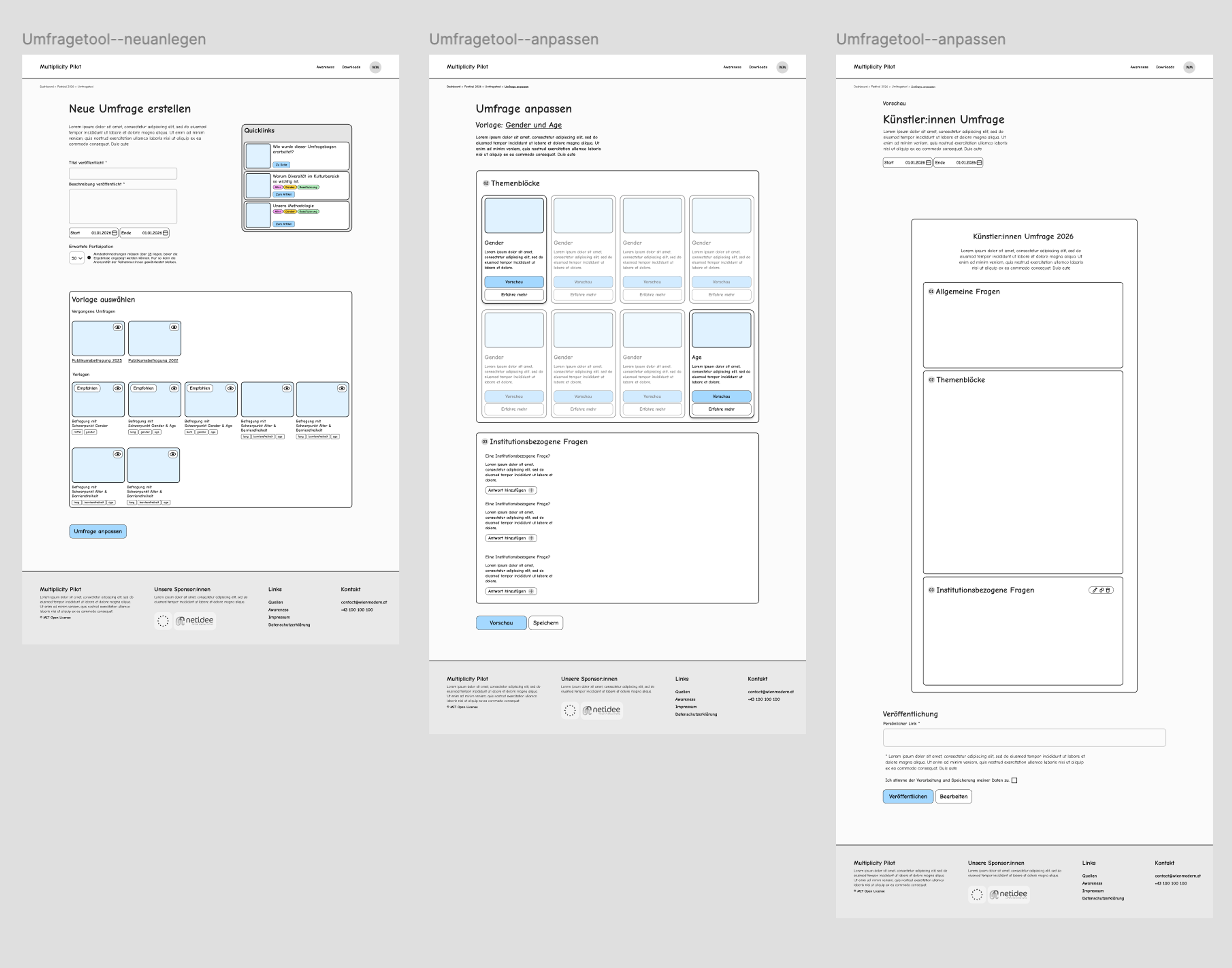
Detailed Wireframes and User Journey
To bring clear structure back into the project, I created a detailed user journey and wireframes. These had to be handed over to the tech company as quickly as possible, so they could begin the technical restructuring before the user interface was finalized.
- 03
Regular Check-Ins and Packages
While I developed the visual language and design, I helped Wien Modern define work packages that could run in parallel and clearly articulate their technical requirements, including a headless CMS, EU-based hosting and a security concept for sensitive data. I also supported them in meetings with the tech company, translating their ideas into concrete technical terms.
User Research
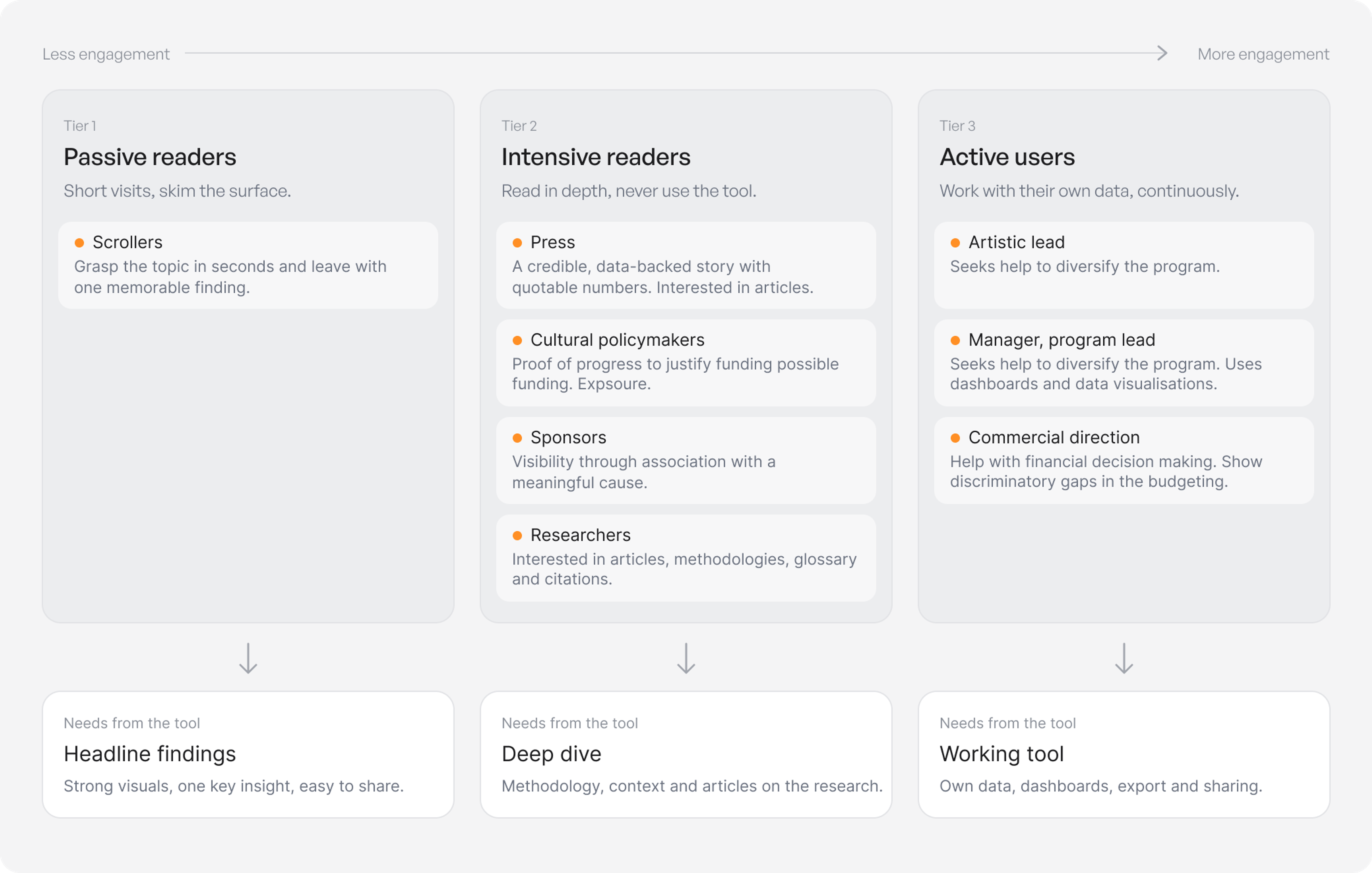
To understand the requirements of the tool, I analysed its potential users in a workshop with the team of Wien Modern and grouped them into three tiers based on their level of engagement: passive readers who skim for a quick headline finding, intensive readers such as press, policymakers, sponsors and researchers who want depth, context and learn about the methodology, and active users within cultural institutions who want to improve their own programs.
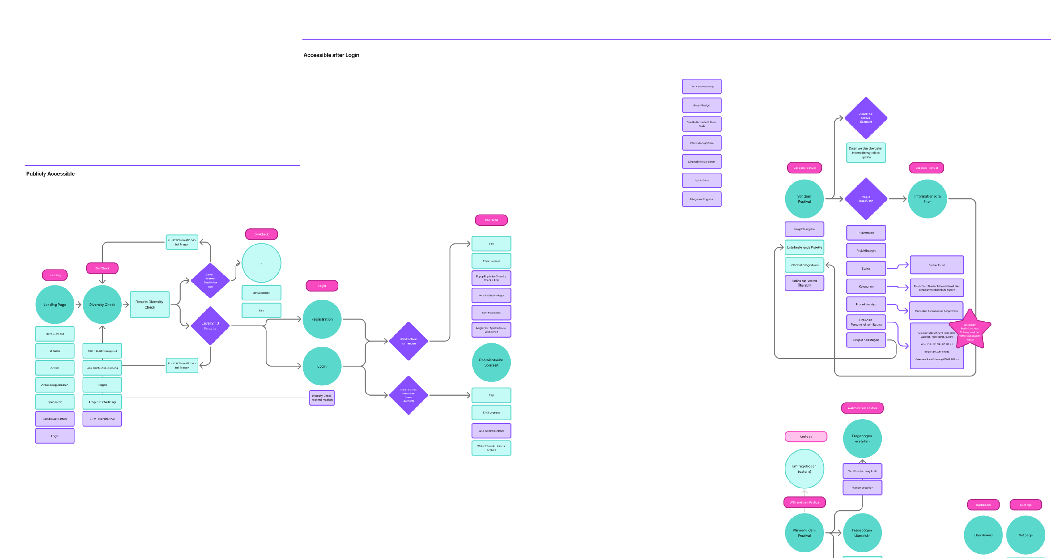
Planning a user journey that works
I began by mapping the previous prototype, which gave us a shared starting point for rethinking the experience and making it more user-friendly. Because the functionality and content were still evolving as I worked, the user journey became an essential tool for keeping track of the project’s fast-moving changes and keeping everyone aligned.
Key Decisions
- The project called for a fundamental rethink of its core functionality, and at the heart of this were the tools that help institutions diversify their programs. Many key decisions had been made before I joined, so my role was to refine them together with the team. We defined what each tool should do and merged those with significant overlap, reducing the analytic tools from three to two.
- After identifying the different user groups, I split the project into two parts: a public landing page open to everyone, and a dashboard that users can only access once they’ve completed the diversity check and registered.
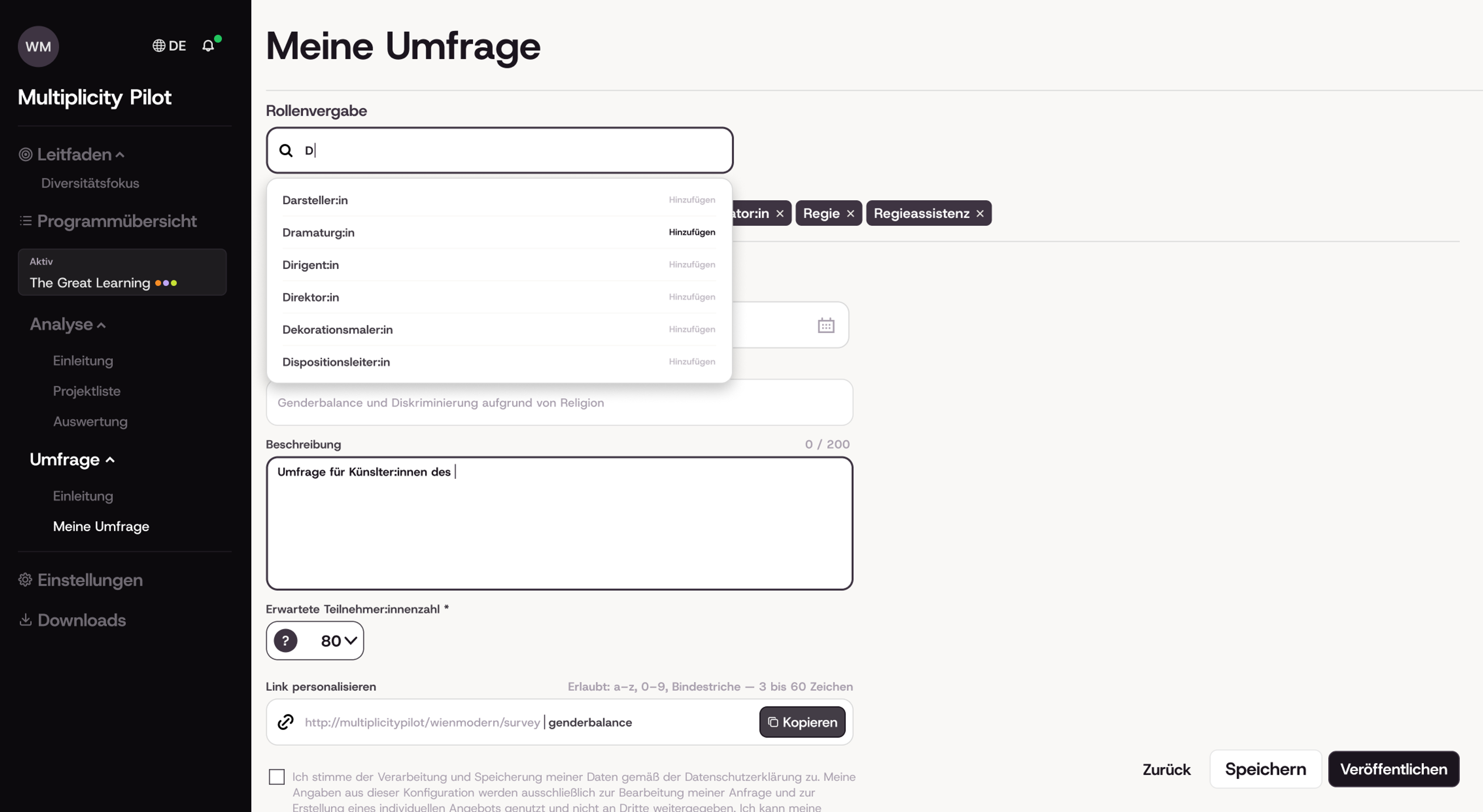
- Because the analytic tools dealt with sensitive language and topics, giving users the right context was a key concern. They needed clear guidance to use the tools responsibly. The first safeguard was a diversity check that every user had to complete before registering. From there, we supported users throughout their work with introduction pages for the program and for each tool, explaining how the tool works, describing the diversity categories, and offering guidelines for applying them. These pages were mandatory on first use, so everyone started with the instructions fresh in mind. To keep that guidance available during the work itself, I also designed in-context support such as a side panel and tooltips.
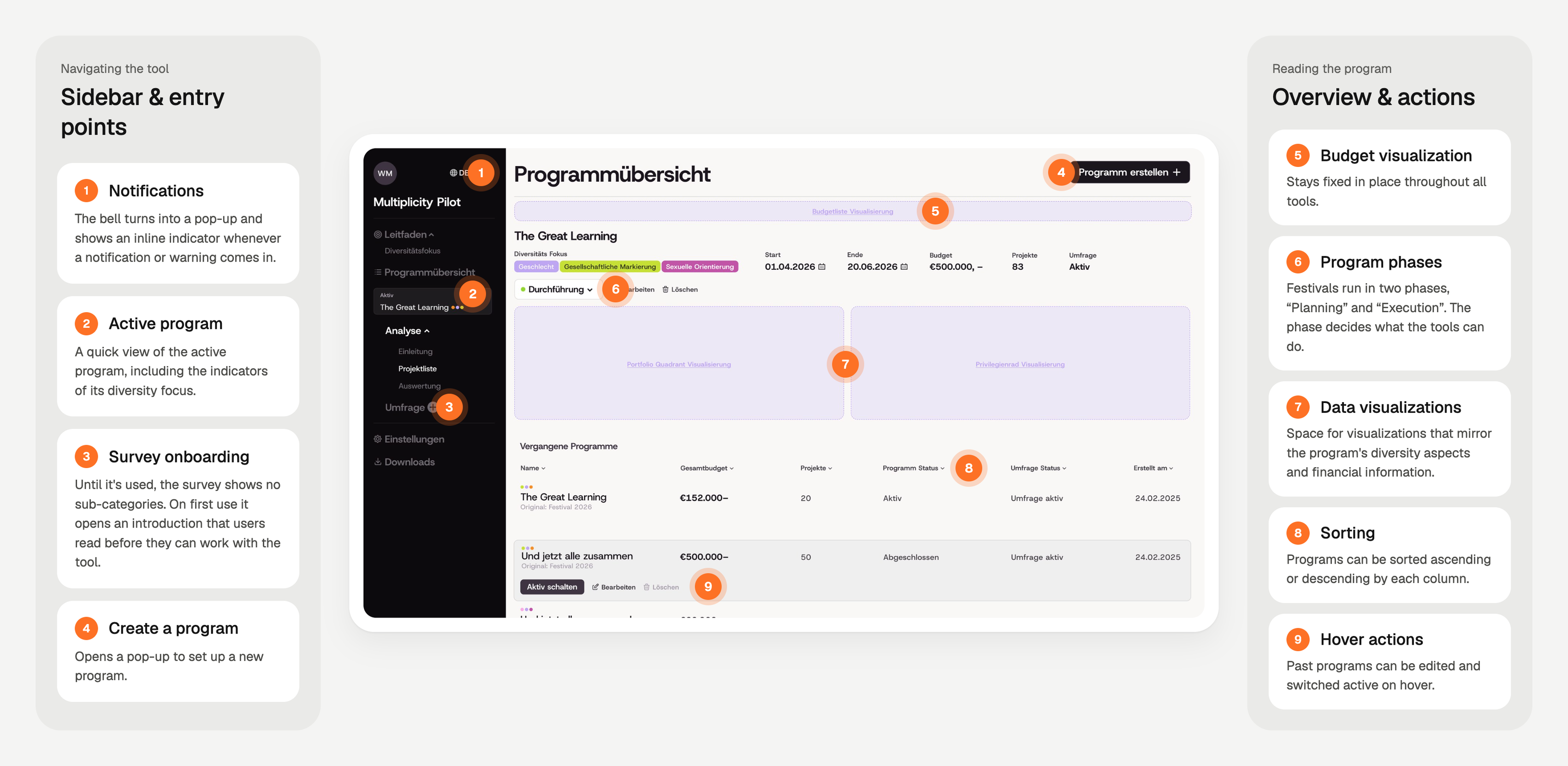
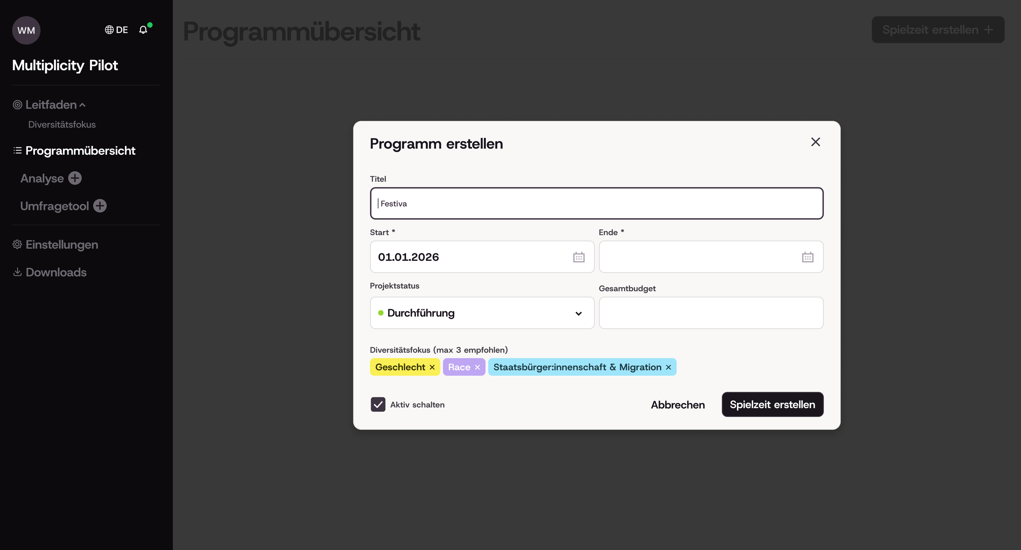
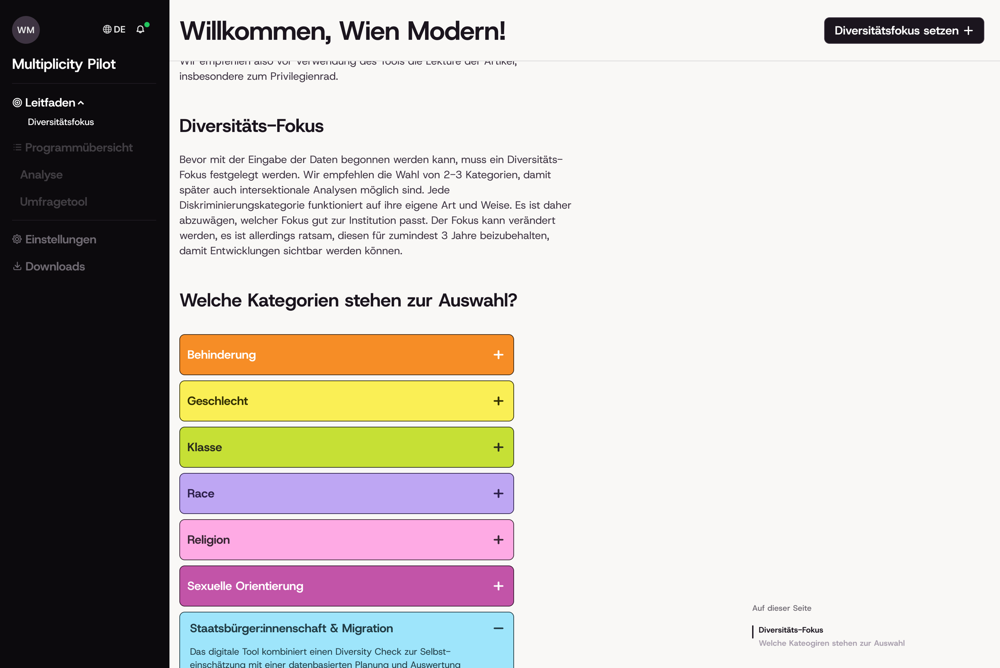
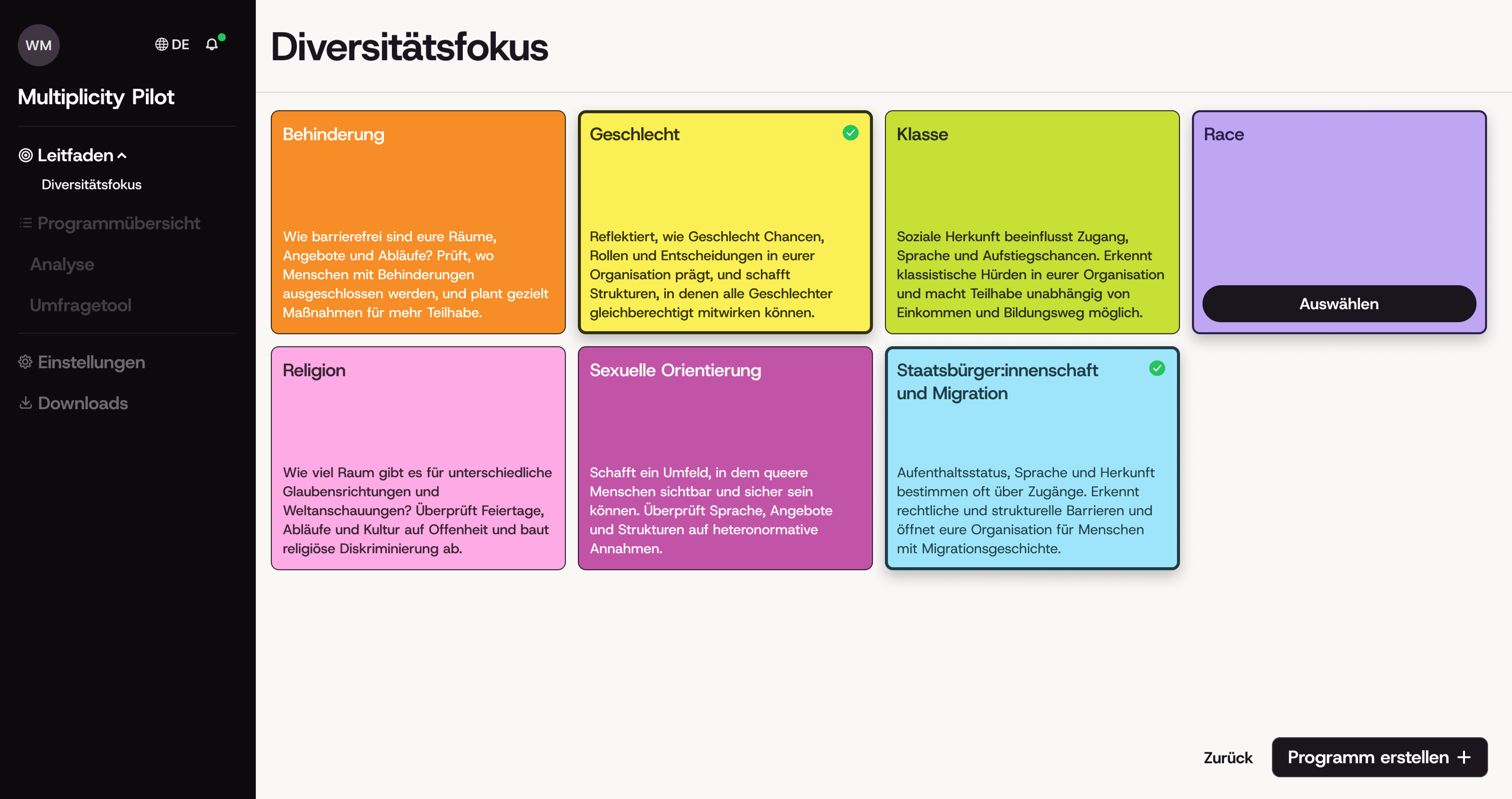
- At the start of each new program, institutions choose a “Diversity Focus”: the diversity categories they want to prioritize that year. This focus then acts as a filter across the interface, narrowing the content in all connected tools to what’s relevant to the chosen categories.
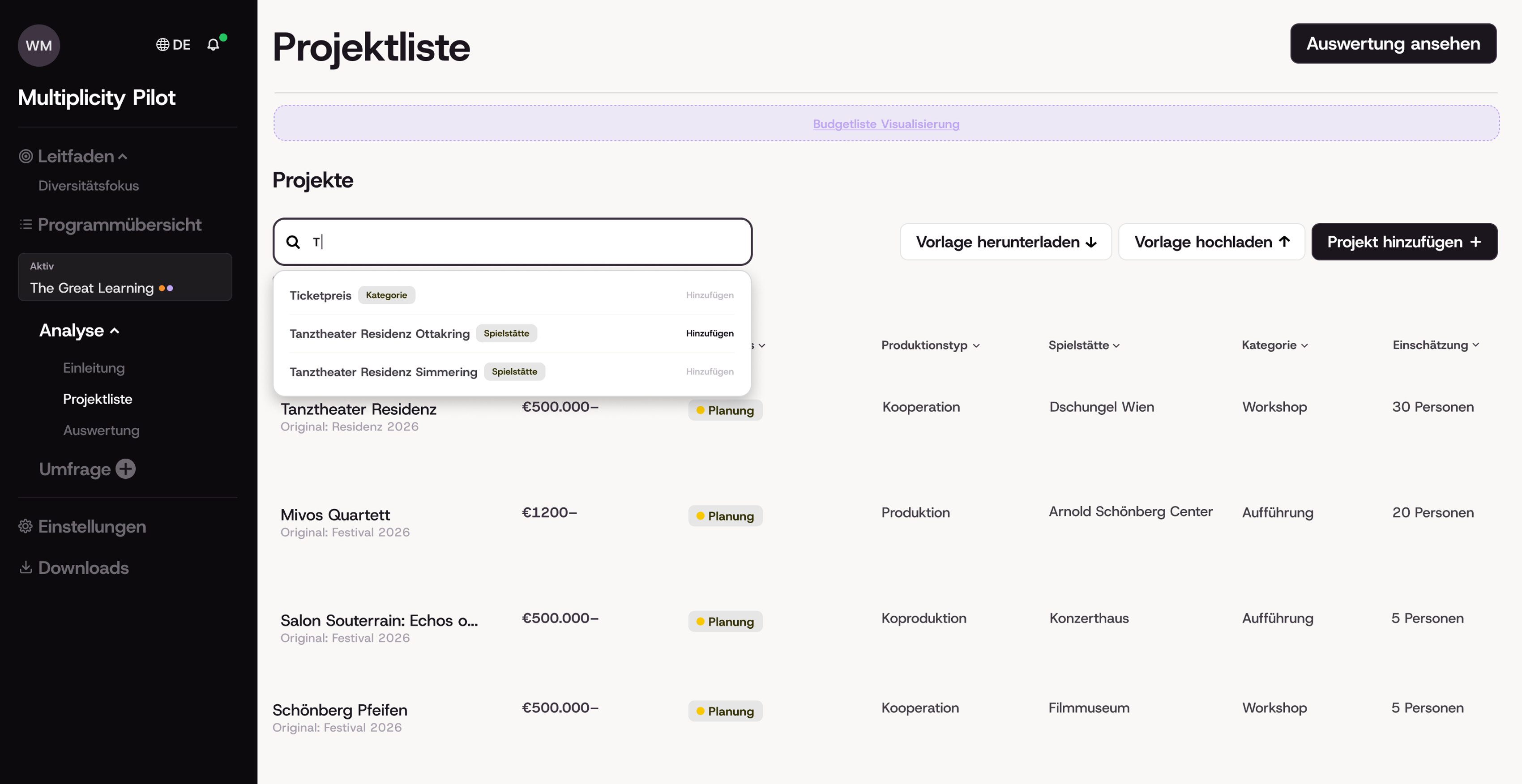
- The dashboard navigation reflects the state of the current program, gives quick access to all tools and information pages, and houses the notification system.
Wireframes
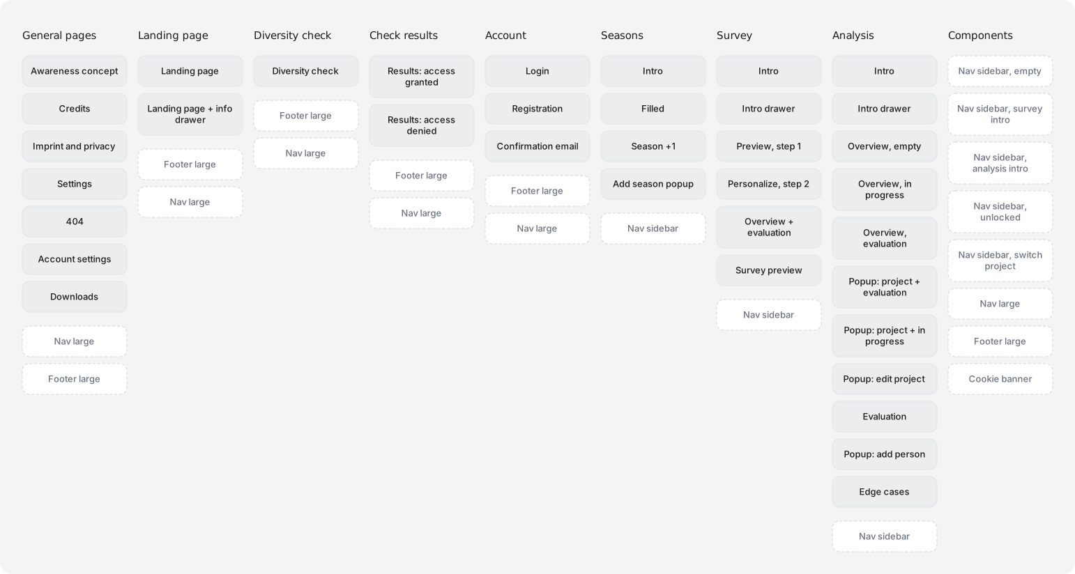
Once the new page structure was in place, I began working on detailed wireframes that communicated the key functionality of the page to the developers, so they could restructure their prototype while I was working on the final screens. The wireframes also proved to be a great base for discussing the current state of the project and figuring out what worked well and what needed refinement.
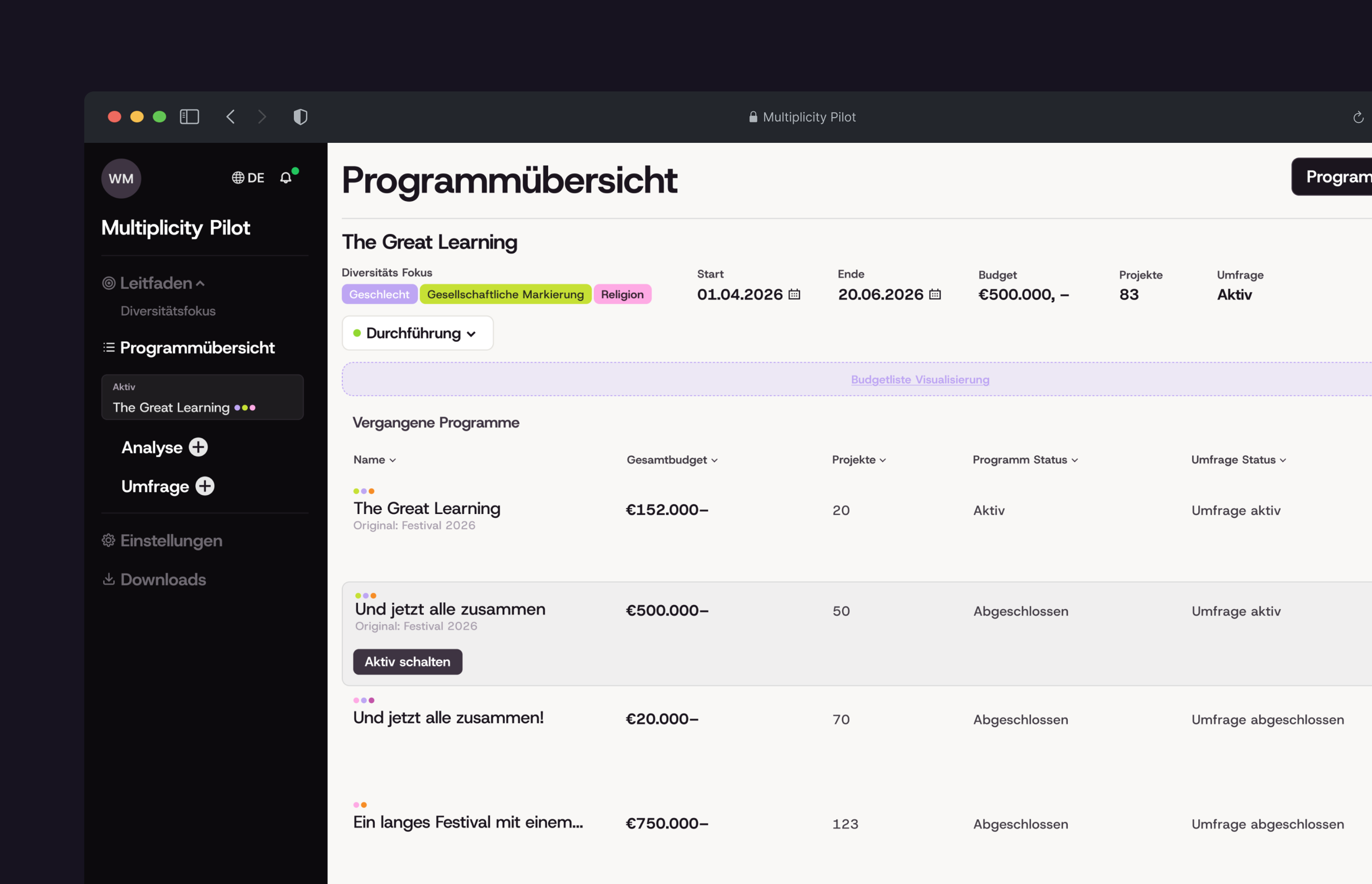
Dashboard Design
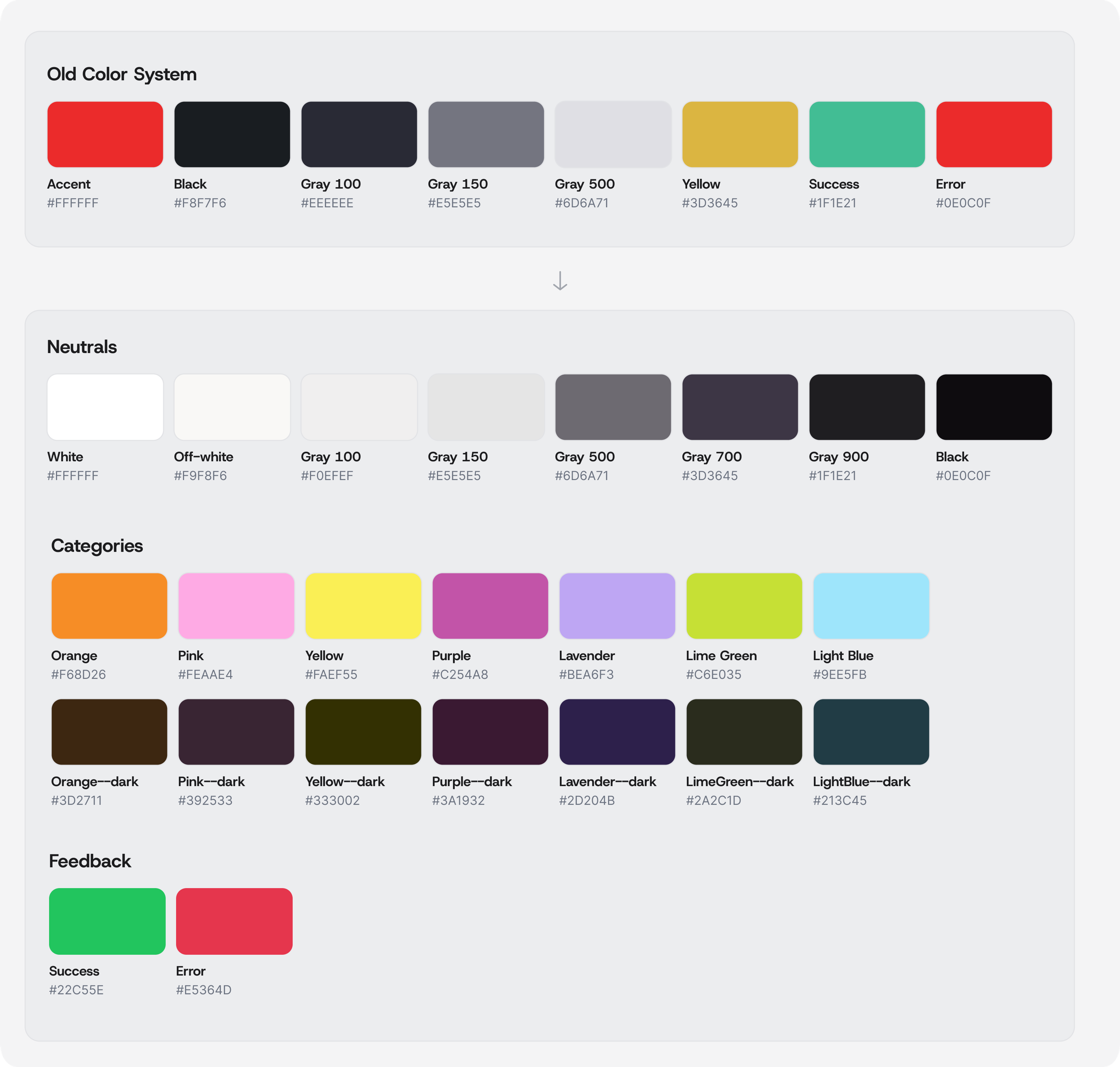
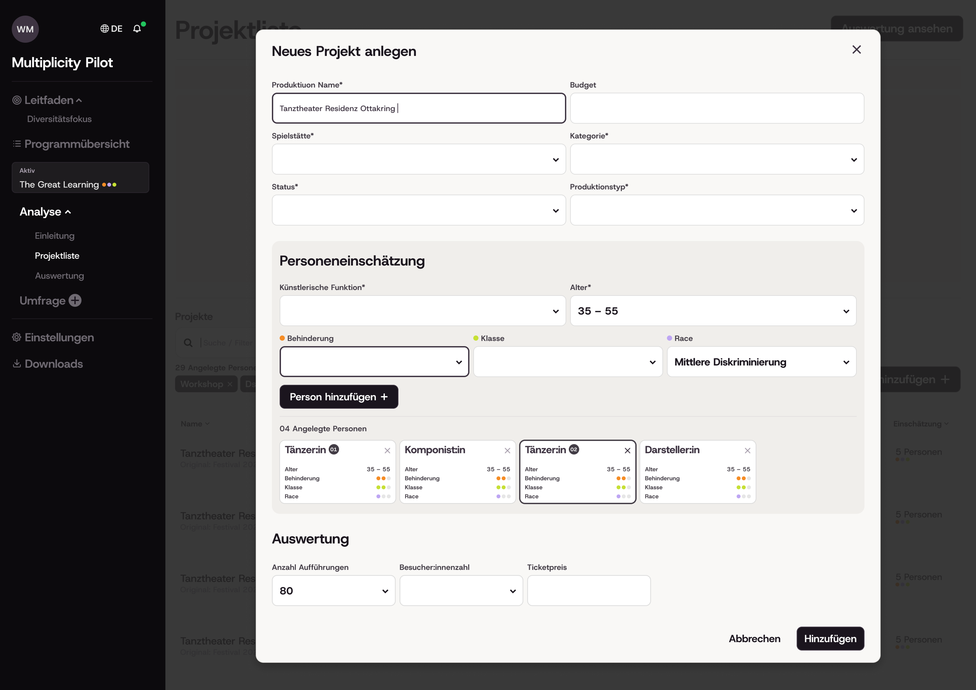
Before designing the dashboard, I defined a visual language built around seven key colors, each linked to a diversity category and paired with a darker shade as text color.
Wien Modern explicitly asked for a more playful approach that would connect to the research they had conducted before the project started. I therefore shifted the original color palette to a lighter theme and added colors that conveyed lightness and diversity, while being careful not to accidentally reinforce societal stereotypes, such as using the color pink to represend gender. To emphasise the more playful (and namely “less techy”) approach I decided to use bigger font styles for many UI elements, as well as thick dark corners for elements in focus, or certain cards. As the project continues to grow I would like to include small illustrations.
A big part of the app's appeal lies in its information graphics. At the current stage of the project, these have not yet been finalised by the external company and will be added once they have been signed off. Until then, the design has been built around them, with dedicated space reserved for their later integration.
Moving on
The project is still in progress and will be finalized in November 2026. The landing page, the information design (developed externally) and the final technical implementation are all still under construction.
The project team has applied for additional funding, which would allow for a more thorough awareness concept and a stronger integration of information visualizations such as the diversity wheel. The next phase is testing, during which the tool will be shared with other cultural organizations and evaluated for its usability.